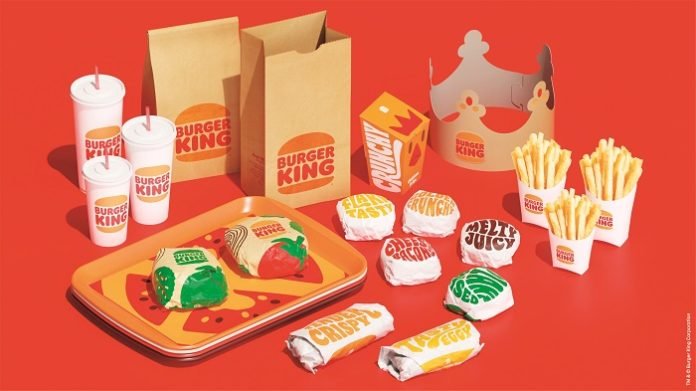
Burger King has recently announced a complete makeover for the first time in 20 years.
The global rebranding includes the logo, packaging, staff uniforms, signage, decor, and merchandise. The new retro-inspired logo uses natural colours inspired by real food. The
brown and red logo is representative of ‘rounded, bold and yummy’ food provided by the brand, which is devoid of artificial preservatives and coloring. The blue curve, part of the logo since 1999, has been eliminated. The fresh Burger King logo uses an in-house
developed font ‘Flame’ with rounded edges. Everything is round like much of the Burger King menu.
The new logo pays tribute to the heritage of the brand and depicts elements of previous logos. The restaurant chain described the new logo as a ‘minimalist logo’ that ‘seamlessly
meets the brand evolution of the times.’
The upgrade of the visual identity is meant to help signal to customers that Burger King is a brand that is evolving, Restaurant Brands International chief marketing officer Fernando Machado said in a press statement. The fastfood enterprise is offering new experiences in food quality in terms of healthier options.
Customers visiting Burger King restaurants would soon meet the new packaging that incorporates natural hues of brown, red, and green. The packaging would also display ‘playful illustrations of ingredients,’ while using superlatives like ‘tasty’ and ‘crispy to describe its mostly traditional food.
The company unveiled its new look on its social media channels on Thursday, 7 January 2021, and gathered mixed a response from its fans and followers. While the new package induced feelings of nostalgia in many, some took the digital route to express their dissatisfaction with the overhaul.
Designers have so far commented favorably on the rebranding and called it a flat design party for the digital age with personality. Similar to 1969 original has been called juicy, plump, and squidgy too. The rebrand is by the Jones Knowles Richie agency.
The rebrand encompasses every element of BK’s visual branding (Image credit: Burger King Corporation) The rebrand by agency Jones Knowles Ritchie is a major overhaul, with no stone left unturned. There’s new packaging, menu design, merchandise, decor, social media and, well, everything really.
Advertising – Burger King rebrand
Watch out for the monogram logo, which flashes up here (Image credit: BurgerKing Corporation) The new logo (complete with a genius monogram iteration, see it above) feels familiar because it is so similar to the 1969 original. The Burger King name is once again simply sandwiched between the two halves of the burger bun, with the blue swish nowhere to be seen. But it feels fresh, too, and that’s mostly down to the juicy new typeface, which is as plump and squidgy as you want your burger to be.
Burger King’s Indian listing
Burger King India is the national master franchisee of the US-headquartered Burger King Corporation, a subsidiary of the Restaurant Brands Internationl. The Indian franchisee has so far opened 268 restaurants in the past five years including nine that are sub-franchised.
50% of its restaurants are in North India followed by the southern and western parts of the country. More than half of the restaurants are in malls, about a quarter in what are called high street locations. Another 15% are drive through outlets and 5% are in metro and train stations. The company plans to take its outlets to a total of 700 by December 2026.
The company issued an initial public offering on the Indian stock market in the beginning of December 2020. Issued at Rs. 60, the stock price zoomed to Rs. 213 and a market cap of Rs. 8,363 crore within four days of its listing on 14 December. However, the stock price has moderated and is currently, on 25 January 2021 at Rs 135.20.


