

Brand architecture is a system that organizes brands, products and services to aid customer access and associate with a brand. A successful brand architecture enables consumers to form opinions and preferences for an entire family of brands by interacting with or learning about only one brand in that family. It also provides a field guide for brand identity development and design, and reminds consumers of the value proposition for the entire brand family.
Camlin has been one of the strongest Indian brands in the stationery industry over the last 80 years. In 2011, Kokuyo, a leading Japanese manufacturer picked up a majority stake in Camlin renaming the company Kokuyo Camlin. Providing stationery products to three major segments – students, artists-designers and professionals, the company’s brand portfolio of over 250 products needed to be structured to create a cohesive brand architecture. The task was made even more complex as not only was the brand required to span the portfolio across three segments, it also had to handle multiple categories and sub-categories like colors including crayons and oil paints, adhesives, paper and other craft items.
Imran Patel, associate creative director of DY Works, says, “Camlin has more than 250 products and obviously we can’t change each package. Thus, we created a matrix system through which we used colors, icons and messaging to come up with a brand architecture. At one level – the brand had the same template – and yet it was distinguishable across its segment and each category and sub-category.”
Citing the example of the food brand Knorr, he says, “Any Knorr product whether it is Chinese noodles or soup needs to be differentiated at the category level. Additionally, each category has a set of variants – and the principles of this architecture must be defined with precision and logic. For Knorr, the green masthead holds the entire portfolio. A Cuppa soup needs to look different from Chinese soup, but at the same time it needs to look like a part of Knorr. We needed a similar holding unit that would tie all the products together at the primary level – irrespective of formats. Whether a crayon or a glue bottle, brand architecture registers the brand integrity into the mind of consumers by maintaining the primary and secondary colors. A lot of brands are adapting to brand architecture and it has become a powerful asset for them which they have used on their website.”
Explaining brand architecture further, Patel says, “Both Camlin and Faber Castell use red, so how does one differentiate them? For consumers it can be confusing and they might consider different brands in the same product range as one. The brand holding unit and or brand architecture principles created for each brand will help them to differentiate their products. Over a period of time, without brand architecture similar products will lose their competitive edge. Brand architecture is not associated with pack aesthetics, but with the vision or principles a brand stands for.”
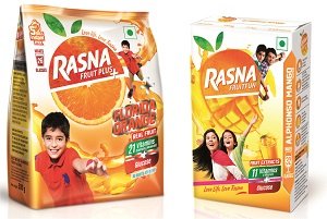
DY Works, one of India’s largest brand strategy and brand design firms, has used brand architecture as an effective strategy to establish portfolios, grow market shares and recruit new consumers for brands such as Kansai Nerolac, Rasna, Kurkure, Lakme and others. Rasna, a heritage brand, is known as a tasty and affordable drink, which has artificial flavouring. DY Works had to rejuvenate the brand and create an architecture across the portfolio which stood for a healthier option across sub-categories and variants.
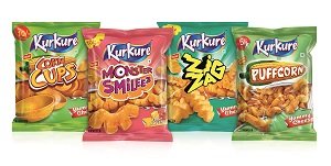
Kukure, one of India’s largest brands in the salty snacks category, wanted to expand and redefine itself as a mega brand. The challenge was to refresh the look, carry forward the strong equity, make existing variants stand out and establish the new range for Kurkure. DY Works created an identity from the current brand and added a spark of energy not only through the identity, font and visuals but also via a strong visual mark of a tear. This tear now acts as an ‘owned property’ for the entire Kukure range. The variant namewas brought up and placed nextto the Kukure brand name thus establishing a better differentiation between Masala Munch and other variants. Each variant identity was given a strong distinctive character to help strengthen it suniqueness. Visual architecture helped to create a clear differentiation among variants.