Indian whisky brand Allied Blenders & Distillers-owned Officer’s Choice took the title of the world’s fastest growing spirits brand for the second year in a row in 2015. Seven Indian whisky brands were in the top 25 and a further five brands making the cut have India as their key market according to wines and spirits industry analyst IWSR.
Whiskies of Japan, Tasmania and Canada have been crowned best in the world in recent years but Scotland’s local dram is truly ‘liquid gold’ to the UK economy, worth nearly £5 billion overall as an industry. Sales of Scotch are three times greater than its closest rival, US whisky. Competition is rife in this high-value global business, and its through masterly design and branding that battles are fought and where desire and anticipation of the drinking experience begins.
In the fiercely fought battle for luxury spend it’s good to be bold and distinctly different, but the result must genuinely resonate with the brand says Sean Thomas, creative director of Jones Knowles Ritchie. The brand story he helped develop for a limited edition Jura whisky picked out themes from the book Nineteen Eighty- Four. George Orwell wrote it on the remote Scottish Island of Jura, where in 1984 the local distillery casked 1,984 bottles of a rare malt whisky that came of age 30 years later. To convey duality and censorship, the bottle hid behind an outer case that was diecut like redacted text, to reveal selected words from the screen-printed bottle. One message comes across dark and menacing; the other is hopeful and poetic. Unveiled in 2014, it caused a real buzz in the market, says Thomas.
“The choice of packaging for high value whiskies is undoubtedly of utmost importance to the sales and marketing of a brand,” says Felicity Murray, editor of TheDrinksReport.com and chair of the design judging panel at the World Whiskies Awards. It has to portray the quality and complexity of the liquid inside, and its provenance and uniqueness, and in global travel retail (GTR) region-specific gift packaging and special or limited edition packs are in high demand, she says.
Travellers like the caché of owning or giving a whisky that is not ubiquitous, observes Hilary Boys, strategic planning director at Lewis Moberly, and consumers the world over look for evidence in the packaging of authenticity and craftsmanship, to help substantiate the high price of luxury whiskies.
In the hands of a multinational owner Glenmorangie has moved from a niche brand to a luxury brand, says Boys: “LVMH recognized that with limited liquid stocks there was an opportunity to raise the premium and reach out to Asian and American markets. These markets were a little more ‘showy’ than ‘knowy’ – hence the rich golden tones and creation of a gold brand identity.”
Lewis Moberly designed packaging for Glenmorangie’s limited release Private Edition series that recreated a malt recipe from 1903. The vintage design for Finealta captures Art Nouveau flamboyance with distinctive typography and a subtle color palette. For something completely different, humour was sneaked into the branding of Monkey Shoulder, which refers to the shoulder strain malt men used to get from turning the malting barley by hand. The design with its three monkeys perched on the bottle shoulder is universally loved but best understood by English-speaking consumers, says Boys. A cocktail suggestion called Make mine a Brass Monkey! refers to a colloquial expression for ‘freezing cold.’
An Art Nouveau look for Glenmorangie Finealta created by Lewis Moberly is fitting for a recreated 1903 whisky recipe
The Glenrothes Extraordinary Cask is a limited edition, super-premium whisky launched into high-end Russian, Asian and American consumer markets in packaging designed by Brandhouse. In Asia, the main driver of consumer choice is ‘face’ and purchases have to reflect well on them. In Russia, perceived value lies in brand reputation, whereas in the US key factors are a rarity and scarcity. The rarity of the contents justified a price-tag up to £3,000 and required a design that created a feeling of unbridled desire and status for all the target markets.
The Glenrothes design befits an haute couture Scotch. The faceted bottle, more typical in luxury perfume, has a stopper made of wood from the barrels and a handengraved, individually numbered plaque on the label. Each bottle is signed by hand by the Master Distiller and Malt Master. Its presentation box is finished in fine leather, a look borrowed from luxury luggage.
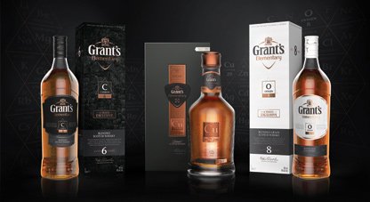
Grant’s Elementary range with packaging design by Webb deVlam is a new GTR ‘exclusive’ for 2016 aimed at the younger whisky drinker. The design visualizes the science behind traditional whisky-making and fuses molecular patterning with the brand’s signature copper and granite tones. Blackened packaging evokes the smoky flavour of Carbon 6 Year Old and pale, pearlized design of Oxygen 8 Year Old hints at its lighter, sweeter nature. The deluxe presentation of Copper 29 Year Old reflects its rarity and includes a prominent copper badge and individual bottle and batch number on the bottle and outer. A select few fine whisky drinkers are in the rich list but many are aficionados and enjoy sampling to discover what they especially like in a drink that is viewed as a luxury around the world. The finest examples of packaging are the curtain-raiser to that satisfyingly indulgent drinking experience.
Packaging South Asia is the cooperating media partner for drupa 2016 which is scheduled to be held from 31 May to 10 June at Dusseldorf, Germany


