

For over six years, Saswata Das, founder-director, WOW Design has helped develop kids-focussed products and packaging for brands like Kellogg’s, Heinz, Beiersdorf, Mattel, ITC’s Yippee and Candyman. In this article, he explains the influence of kids on purchase decisions and what goes behind developing packaging design for kids.
What if I told you that we have a consumer who wants to buy everything that you offer, no matter what it costs? Isn’t it every marketer’s dream? Can it be a reality? Yes, we are talking about kids. Kids may be the youngest of consumers, but their influence can be immense while shaping household purchase decisions. The same can be described by the term ‘Kidfluence.’
 They constitute a very important demographic for the marketer. In fact, their purchasing power if compared to that of us when we were young is “much more.” Also, in context of our childhood, today’s kids and their pestering as well as persuasive power are so strong that they influence their parents to the extremes. Therefore, they influence their parent’s buying decisions and are also the adult purchasers of tomorrow.
I have always believed that packaging is the most tangible form of brand that the consumer interacts with. Hence, marketers should be using packaging smartly, not merely for product selling, but to even sell the brand. Packaging design must be used to differentiate amongst the plethora of options available to our consumers today. The success of any brand will depend on identifying the opportunities and meeting the unmet needs of the consumer.
And for that, we dig deep for exploring insights, generate consumer understanding and develop empathy for the consumer. This helps us create packaging that appeals to her or on an emotional level and is more relevant to her.
Even though kids respond to emotional stimuli more than their adult counterparts, it’s more difficult to impress them as they are also easily distracted by the sheer variety of options available. In order to encourage deeper engagement with our packaging, it must be able to engage with their senses.
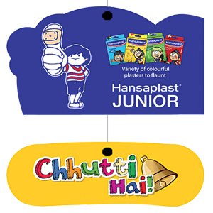
We have been working with Beiersdorf, a 125-year-old leading skincare company, and one of the recent exercises was to launch an exciting new product for kids, under their trusted plaster brand Hansaplast.
Hansaplast wanted to introduce a range of designer plasters especially for kids. The designs developed for the plaster were segregated into four subcategories – being brave, being stylish, having a hobby and lastly expressing him/her. The objective was to give the brand and its subcategories a personality through the mode of packaging that would not only appeal to the target group (TG) but also effectively convey the objective of the product.
The first step was to have a dialogue with the kids and their parents to understand the intricacies of the category and develop empathy for the consumer. We conducted a dipstick research to understand what kids do, what they aspire to, their lingo and so on. We even focussed on what are the parameters in the context of attraction and packaging when it comes to kids. We learnt that today’s kids are outgoing and are involved in fun and interactive activities. They love to flaunt their belongings and are attracted to vibrant colors, unique shapes and whimsical facial expressions. This led to initiating various concepts which kids could directly relate to and one of these ideas was to portray the designer plasters as a tattoo and bring out the flaunt factor very strongly as the final outcome.
While it’s the kid’s choice of brand, the parent’s approval is another important factor. Hence, the biggest challenge was to appeal to both simultaneously. Kid’s packaging required bipolar messaging to attract them both. So for a food product while the kids are seeking the fun factor, the parents need to be assured of the health factor, so that it can become the obvious and right choice.
Similarly for Hansaplast, we had to strike a balance in communication, which would not only appeal to kids, but would also give the parents an assurance that the brand is communicating in a way they would like to raise their kids. On probing as to how kids relate to wounds, we learnt that a painful injury can be looked through a completely different perspective. We wanted to make the process of healing, fun and engaging. The core thought was to offer the kids a combo of fun and courage to keep going. The competent nature of today’s kids, their aspirations and daily activities played a pivotal role in building up the ‘Never give up’ spirit in terms of branding and its variation. What struck a chord with parents was the message – ‘As you’re growing up, each time you fall or hurt yourself, you become an inch stronger. So if you get hurt, flaunt your wounds in style!’
Like all of us, kids also live in a world of infinite options. The key is to create lasting relationships between our brand and them so that we feature in their shortlisted few when they are processing and filtering information at God’s speed. Ultimately they should be able to feel ‘That Brand is for Me.’ In this context, packaging does the magic here.

Kids like any other consumer, love personalization. If you are able to convince them that your brand is making products specifically designed for them, your job is done!
We proposed the name ‘Junior,’ as a sub-brand under Hansaplast, as it communicated a series of fun plasters specifically made for kids. It’s no longer the regular, boring-looking plaster which their parents use. It’s more fun and stylish, unlike the regular and boring looking plasters which their parents use.
We introduced four variant names and colors, each depicting its own personality trait.
- Red for bravery, was termed – ‘Daredevil’
- Green for a kid’s style quotient, was named – ‘Style O’
- Yellow for a kid’s artistic capabilities, was named ‘Doodle’
- Blue illustrates the fascination through the name – ‘Wow.’
The story on each pack is tactfully woven around the product and certain elements are highlighted via 3D extrusions jutting out of the header of each pack, which is used to hang the pack at the retail store. The Hansaplast Junior packaging has a very high impulse value and can appeal to both the kids and their parents. Each pack clearly communicates the individual category of a plaster it carries; while they all belong to one brand family. The packaging for such kid-focussed products, which tempt them to see, touch, feel and interact, stands a much higher chance of being picked up. It should surprise and generate curiosity.

Packaging Soth Asia is a cooperating media partner for drupa 2016 which was held from 31 May to 10 June at Dusseldorf, Germany