

As president of the international jury, more than 1,500 creations competing for each annual award pass through my hands. And the same goes for every year. I’ve no idea what they add up to. The global success of the Pentawards, founded 10 years ago by the designers Brigitte and Jean Jacques Evrard, is absolutely awe-inspiring. It is tempting to try to learn something from the awards list, even though packaging design is constantly on the move. It is especially tempting to wonder how creatives across the world approach the process of innovation. To be sure, trends appear and regional tendencies emerge; indeed, local quirks become ingrained with the passage of time. So much so that some members of the jury can identify the packaging’s country of origin at the first glance—and they are seldom wrong. Let’s face it: although it is true that national culture has its effect on the creation of products and their packaging, especially in the realm of food, it is no less true that designers, whether from north or south, east or west, rely on the same methods when it comes to innovation.
Even so, the degree of innovation isn’t the same everywhere, as year after year I’m surprised to see how many astonishing creations come from countries that don’t spring immediately to mind when we think about packaging design, such as Kazakhstan, Cyprus, Peru and Vietnam. Why is that? Let me suggest an answer. In these countries, which are currently emerging in the fi eld of design, marketing constraints are only minimal. Maybe this is something for economically advanced countries to consider.
Seven ways to be innovative
After 10 years of Pentawards, it is possible to list seven more effective ways of approaching innovation in packaging design. I won’t pretend that the list is complete, but my analysis is based on creations originating from more than 50 different countries. You will find fresh examples in this fourth edition of The Packaging Design Book. I list them in no particular order.
Distort the product’s intended use

charity
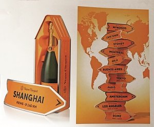
This is probably one of the most daring, but also intriguing, approaches, which can’t fail to arouse the consumer’s interest. That is, when it succeeds; it’s all too easy to get it wrong. Take the example of Japanese toilet rolls packaged to look like a piece of fruit—a strawberry, kiwi fruit, or a watermelon (1). And the British “Eggs for Soldiers,” packed in military-style boxes and raising funds for charity (2), or Veuve Cliquot packaged to look like a road sign pointing to cities around the world (3).
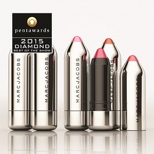
Ignore the packaging stage
and say immediately what the product is used for. This gives the consumer the feeling of being in direct contact with the product itself, even though the goods are not being sold loose. It’s a stroke of genius, making for maximum shelf impact. Like the Russian beer (4) whose one-liter plastic packaging looks exactly like a glass of beer that is ready to drink; or individual portions of French jam in plastic packaging, tailored to resemble fruits such as apples or pears (5); not forgetting the Marc Jacobs lipsticks shaped like pencils (6).
Overplay what the product is used for

It’s a well-known fact that packaging must accentuate any specific characteristic that distinguishes one product from another. But here, designers go a step further, exaggerating and distorting this special feature by visuals designed to shock. Of course, the shock should be a positive one – but this isn’t always the case. Nevertheless, it works! Think of the packaging for boots from Kazakhstan on which scary-looking eels wind themselves round the boots to demonstrate how waterproof they are (7). Or, the fruits from Thailand, labeled with a close-up image of each fruit that takes over the whole label (8); and the little bottles of Orangina with their beach theme (9). It takes nerve as well as in-depth knowledge of the target consumer to adopt this type of approach.
Play on emotions
Neurologists have taught me that nothing is memorable where there is no show
of emotion. Memories are born out of love. With this in mind, it doesn’t get better
than the jars of British baby food. One jar is adorned with the portrait of a cute
toddler wearing a tomato stalk as a hat—of course, this is the packaging for tomato soup—who is blowing a great big kiss to the customer. The fun continues
with another cherub sporting strawberry leaves. Simply irresistible (10).
Find other ways to show how products are used
Rather than showing a big plateful of chicken, the designer preferred to decorate the container with over-the-top images of an enormous bird standing next
to a man in a rocking chair (11). Or, the Russian ready-made sauces represented
by a young man or woman in an apron standing over a saucepan and smiling
straight at the camera (12). No sign at all of the finished dish simmering away.
Turn the product into an actor and give it a role to play!
One of the golden rules of packaging design is to place the product centerstage and treat it like a star. The great global brands know all about taking this approach. One of the smartest examples I’ve ever seen has to be Hands Up, a South
Korean brand of deodorant with packs adorned with broad grins drawn in black
felt-tip pen, while a pair of transparent plastic arms stuck to the stick show what
the product is used for (13); or, the Japanese tissues that simply show images of
people using them with no superfluous text (14).
Borrow from the de luxe brands
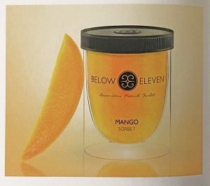
When it comes to marketing mass-produced goods that are consumed on a
grand scale, or others still stuck with the same old image, a new way of attracting
consumer attention is to use the visual language of the high-end brands—a language suggesting quality, distinction and status which we don’t tend to associate
with this level of products. Like the sorbet from Thailand packaged in clear glass
(15) or the packaging specially designed for a Spanish brand of ham, presented
in a magnificent black case with a handle in the shape of a small gold pig (16). A
touch of class that works right across the product range.
Ten creative years – but has anything changed?

It’s a well-known fact there aren’t many tools designers can use. Like a composer, the designer has just a few “notes”—colors, shapes, texts, photos, or other images, and sometimes a choice of materials from which to write an entire “score.”
Over the past 10 years, the tools have pretty much stayed the same. So, too, has
consumer behavior. I’m not talking about superficial changes in fashion, but our
day-to-day routines. Every act of buying is based on certain fundamental assumptions and certain codes that must be closely analyzed before launching a new
packaging design. This means that the designer must find ideas and tricks like
those we have just seen here, so as to afresh in a context where fashions change
faster than deep-rooted habits.