
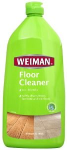
Weiman Products’ shift from a green PET bottle to a custom white HDPE package with a unique silhouette, lifestyle labeling and premium look sent sales of its floor cleaner products soaring, proving that you don’t need color to stand out on the shelf.
Color can be a differentiator on the retail shelf, but the absence of color can sometimes be a better choice. A white bottle can serve as a neutral backdrop for color-coded labels and closures, eliminating visual competition from the container itself. It can send a subliminal message of purity, wholesomeness and cleanliness. It can stand out amid a sea of brightly colored competitors. And, in a category dominated by bold saturated colors, it can convey a premium image that instantly separates a brand from everything else in the category.
One company that has discovered the might of white is Weiman Products, a US-based manufacturer of household cleaning products. In the first 12 months after switching its floor cleaning SKUs from lime green PET tapered oblong bottles to a curvy custom 27 oz white HDPE oblong package and simultaneously expanding the number of SKUs from two to five, Weiman tripled sales of the line and secured key new placements in major chains like Walmart — the world’s largest retailer that operates in India as best price modern wholesale.
The new bottle was designed, engineered and sourced by the Studio One Eleven design division of Berlin Packaging, a leading US packaging supplier with more than 90 sales and warehouse locations across North America plus a global packaging group with factory partners in countries including China, India, Europe, Australia and Vietnam. All studio design services were supplied at no charge in exchange for Weiman’s purchase of all containers and closures from Berlin Packaging.
The Studio One Eleven team recommended the use of a white bottle as a canvas for Weiman’s floor care line after extensive category analysis and requests by the client for a new package with more real estate for artwork and product positioning as well as stronger differentiation in shape, color and closure. Designers also developed a unique silhouette and proposed a new benefit-driven communication architecture that worked in conjunction with the white motif to transform the original pedestrian-looking bottle into an elegant, upscale package that shines on the shelf while communicating key product qualities.
Goodbye, green
selected to send a ‘green’ message about the products’ eco friendly formula
Founded in 1941, Weiman Products sells products such as bathroom, furniture and stainless steel cleaners to some of the top mass market retailers, supermarkets, hardware stores and home improvement centres in North America. The company expanded into the floor cleaner category in 2007 with vibrant green PET oblong bottles selected to send a ‘green’ message about the products’ eco-friendly formula.
By 2011, however, it became clear that the new Weiman floor cleaner and floor polish products were underperforming. The company decided to replace those two all-purpose products with five SKUs segmented for use with hardwood, carpet, laminate and stone floors. They also elected to simultaneously relaunch the line with a completely new packaging aesthetic.
“Our product formulation was better than our competitors,’ but our market share wasn’t growing at the rate we wanted,” said Weiman programme director, Prachi Junnarkar. “We did a lot of internal marketing analysis and consumer surveys, and we determined that one of the stumbling blocks was our packaging and labeling. We weren’t communicating our brand quality, telling our product story clearly, or differentiating ourselves from the competition. We needed a total package makeover to accomplish those goals.”
Hello, white
With those parameters in mind, the Studio One Eleven team began by visiting stores to examine competitive products’ packaging, document merchandizing standards, and interview store employees about their perceptions of the Weiman product. After analyzing their findings, the team concluded that the bottle structure needed to be both modernized and feminized to pump up the shelf appeal. It also needed a large central panel to maximize label space, along with a communication architecture that focused less on cleaning power and more on the non-toxic properties of the Weiman formula through images reinforcing that it is safe to use around children and pets.
The studio then developed initial package concepts that included proposing the use of white bottles for all the reasons mentioned earlier as well as to align with the white bottle or black closure brand structure used with most other Weiman products. While the design team included the option to use a natural resin because of the association of earth tones with hardwood floors, Weiman immediately concurred with the studio that white was right for the new initiative.
The final design features an offset shoulder, soft curves suggesting gentleness, and a tapered base that contributes to the softened profile, all marking a sharp contrast from the straight sides of the outgoing package. The narrow neck also enables easy ergonomic handling, with grip indicators cuing consumers where to place their fingers. HDPE was used both to facilitate production of the offset neck and to match other products in Weiman’s portfolio.
The shape of the shoulder was moderated during the prototype stage to allow the same bottle to be manufactured with both 28/400 and 28 mm ratchet neck finishes for use with different SKUs requiring flip tops and trigger sprayers, respectively, saving Weiman the cost of building two different bottle molds. The shoulder modifications also ensured that the trigger would not cause trouble on the filling line by overhanging the base. Stock black trigger sprayers are used on the trigger bottles, and off-the-shelf flip top caps color-coded to match product labels are used on the squeeze bottles.
The label panel follows the contours of the bottle and covers most of the real estate on both the front and back of the package, accommodating pressure-sensitive labels that are diecut to mirror the panel shape. The visual architecture, inspired by the studio’s branding strategy and developed by Weiman art director, Rhonda Fonk, is dominated by charming photos of babies, dogs and feet on the floor surface type corresponding to the relevant SKU. Callouts like ‘all natural’ and ‘non-toxic’ reinforce the visual message that the products are family-friendly.
Six weeks to market
Shortly before all design components were finalized, Weiman faced a critical deadline to present the relaunched line to Walmart. Berlin Packaging consultant, Ann Fisher, arranged to expedite production of starch models for the meeting, personally picked up the finished models, and hand-delivered them to Weiman in time for the presentation. Weiman managers walked away from the meeting with an order and barely two months to ship products — even though the production molds had not yet been built.
Six weeks later, thanks to fast work by Berlin Packaging’s sourcing and supplier management teams, Weiman had the finished bottles in hand and was able to meet Walmart’s timeline. Today, Berlin Packaging maintains both the bottles and closures at a warehouse less than 90 minutes from Weiman headquarters and delivers them to Weiman or its co-packer on demand for filling and subsequent shipping to customers in the US, Canada and Mexico.
“Our bottle is our #1 salesman, and our old package wasn’t doing the job. The growth in our floor cleaner line proves that the new bottle is sending the right message to shoppers,” said Weiman’s Junnarkar. “People may think of white as being a conservative package choice, but in our case it really raised the bar. With a green package, consumers didn’t seem to take us seriously or even notice us on the shelf. Now we turn heads, and that drives sales.”
Berlin Packaging is North America’s only hybrid packaging supplier of plastic, glass, and metal containers and closures. The company supplies billions of items annually along with package design, financing, consulting, warehousing and logistics services for customers across all industries. The company can be contacted at BerlinPackaging.com.