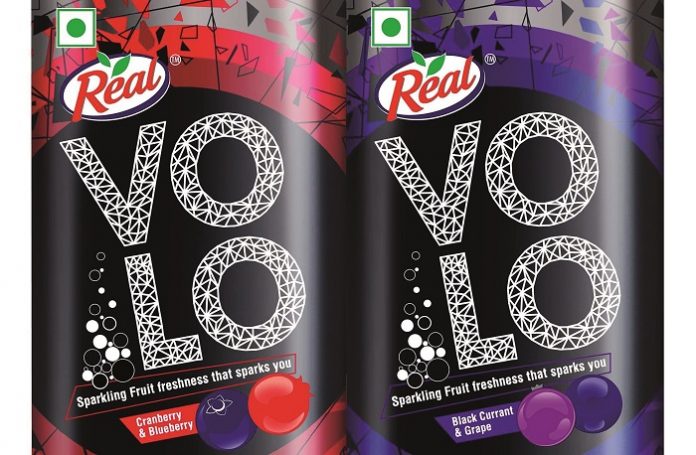
On the packaging design front, special care was taken in design development to achieve the desired output on aluminum cans. The entire design was done in spot colors and is made entirely of Pantone shades (CMYK printing is not easily done on 2-piece cans in India).
Among the restrictions, there were no half-tones used and no vignettes. Vignettes could run vertically, but full vignettes cannot run around the can. No two colors could be mixed to achieve a third. WOW Design ensured all lowercase characters in the design are at least 1.2 mm in height and sans serif.
For this printing or decoration process, transparent inks are recommended on a clear base to achieve a shiny look to the design. Opaque inks are recommended to reduce the reflectance from the base material. It goes without saying but to avoid readability problems WOW Design always ensures a good contrast between the text and surrounding colors.


