Semiotics is a tool sociologists and anthropologists use to study cultures. Quite simply — it is the study of symbols. When we decode certain cultural symbols, we get a deeper understanding of society. For example — the symbolic gesture of touching the feet of elders tells us about a society that gives respect to age. Thus, we understand why in India, we have age-bound promotions rather than it being a true meritocracy. Symbols can be of any kind. When we see a man being shown on a motorcycle as against a scooter — we form many opinions about him. That he is young minded, possibly does not have kids yet, is more independent and so on. This study of symbols is called semiotics. As a design firm, we use semiotics extensively to ‘embed’ symbols that connote specific values or messages to consumers. For example, for a bank project, we needed to show that something was truly easy. We, however, did not use an image of blowing bubbles as bubbles have very negative connotations with banks. We have heard of bubbles bursting and thus, used the imagery of a feather to show something was light and simple.
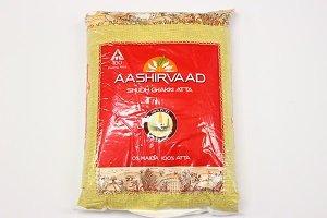
When it comes to packaging, understanding semiotics is an extremely valuable tool to create robust brands and win market shares. For example, the use of jute texture printed on the poly bag of atta raises the question — what was the necessity of creating a replica of the real gunny bag? As marketers, the task for branded atta makers is to shift consumers from the habit of freshly ground flour to packaged flour. The gunny sack cues chakki freshness makes it easier for consumers to accept the product.

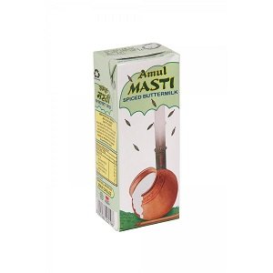
churning ladle inside the matka has jeera seeds
that are randomly scattered on the pack. While the
design itself might not be the most aesthetically
appealing, the embedded semiotic significance of
the traditional chaas is truly significant and it tells
the consumer that it is a product as good as fresh
buttermilk.
Tetra packs, as we all know, brought convenience into everyone’s life. Most of us have consumed Frooti, which was in tetra packs, when we were kids. Now as adults, we are consuming a wide variety of juices, from carrot to pineapple to exotic guava. A variety of products, from cooking oil to whisky, are being sold in tetra packs. Tetra packs have battled the perception of ‘not as good’ as fresh.
In that context, let us study the Amul Chaas pack. One might notice the chaas ka matka, with a churning ladle inside the matka, and the chaas that is flowing over. There are jeera seeds that are randomly scattered on the pack. While the design itself might not be the most aesthetically appealing, the embedded semiotic significance of the traditional chaas is truly significant and it tells the consumer that it is a product as good as fresh buttermilk. That is to say that by embedding a wealth of cultural context, the design has a high level of decoding of visual cues for the viewer.
The consumers who are expecting to consume authentic chaas are happily picking it up, many of whom I see in my office, consuming chaas in the lunch hour. If you ask them why are they consuming, why do they prefer Amul chaas; you get all rational answers like — tastes good, healthy, Amul is a trusted brand, after lunch I have habit of consuming chaas, and more . . .
The in articulated need is that everyone is looking for a brand that gives the assurance of being authentic in its nature. Generally food category consumers are looking for authentic and genuine ingredient stories, the packaging design that has embedded this thought in the design vibes well with its target group. In the case of Amul chaas, matka being the semiotic hook of authenticity, gives a great deal of semiotic significance to the product. Similarly, the jute texture on the Aashirvaad atta bag adds to the perception of the product being genuine.
Another hidden semiotic cue on the Amul chaas pack is the chaas matka overflowing. Abundance of dairy (doodh ki nadiyan behti thi has been a sign of prosperity traditionally) products is a sign of prosperity and indulgence. A kalash filled with rice grains, and more is often being used in Indian festivals to celebrate prosperity.
Premium Harvest pack design harnessed the semiotic fact of birds being especially skilled for choosing and pecking the best grains among the ordinary one. The graphic depiction of the bird as an ambassador for the brand perfectly fits the story of the brand as a selector of highly assorted grains. Another example is Dove soaps. A brand that stands for a high content of moisturizer broke through the soap clutter to create a truly differentiated product.

The use of the color white, along with the name Dove signifies peace. There is no conflict in this product with your skin and it is gentle and smooth. This is a masterful device that immediately brings the main proposition alive. Secondly, by not saying ‘soap’ anywhere; the words ‘beauty cream bar’ completely reposition the product. Words can be symbolic too — and in this case have been beautifully leveraged by Unilever! The use of the empty white space also talks of the no-nonsense approach of the brand. It is, after all, a REAL soap for REAL people. The visual of the pouring creamy moisturizer completes the Dove story. A large part of the brands success can be attributed to the semiotic story being told well through the packaging.
There are situations where the product can be brilliant, but there is little understanding of the product promise or benefit by consumers as the design does not illustrate this visibly. The brand Himalayan water uses a fuchsia pink. While it stands out amidst clutter, it is the color of indulgence, of holi, of bright lehngas, of Victoria’s Secret lingerie and so on. The color does not cue PURE, crystal clear water with benefits of the Himalayan springs.
Semiotics is a powerful lens through which we can gain an insight into the mind of the consumer. With this awareness we can craft meaningful designs that can gain mind share and market share for products and brands.


