Continuing with my article last time on ‘How to Reach Out to the Health Conscious,’ this time we shall explore how you can differentiate your offerings for different target groups. How do you use design as a strategic tool to help consumers differentiate between the ‘Better For You’ and ‘Naturally Healthy’ range and decide the right product for themselves?
Years back, when I was involved in launching the Multigrain Atta variant for ITC under its flagship staple brand Aashirvaad, we decided to move away from its award-winning design elements of the jute slug and the madhubani art band on top, which has a strong recall for its base variant and the premium Select version. We created a different visual architecture altogether to make it stand out as the healthier variant with more focus on demonstrating the rich multiplicity of five grains that make up the atta and the associated health benefits for the consumer.
Almost a decade later, I was involved in a similar exercise of differentiating the healthier range from the core one. This time, it was a revamp rather than a new launch for Dabur, one of India’s largest FMCG companies and a trusted name in the global market. Its renowned brand, Real, offers packaged fruit juices. Real, a brand that has enjoyed customer appreciation as the most trusted fruit juice brand for four years in a row, has a range of 14 exciting variants from exotic Indian Mango and Mausambi to Cranberry, Peach, Blackcurrant and Grape. Made from the best quality fruits, Real claims not to contain any artificial flavor or preservative. It has a sugar-free range under the sub-brand Activ. Real Active has been positioned as a premium, health brand as compared to the mass, fruit juice brand Real. Real Activ comes with a differentiated range like Fruit+Veggie, Fiber+, etc. and is sold at a premium price.
The business problem
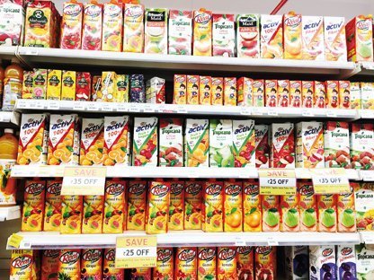
Real Activ as a brand was scoring low on salience (low awareness and low trial rate) whereas within the Juice and Nectar category, Real had a very high score of both awareness and trials. Consumers were not able to perceive this brand as any different to Tropicana or Real fruit power. They were also not trying the brand citing reasons like cost and indifference to the brand, which in turn led to sluggish brand growth. Real Activ lacks differentiation from its competitor Tropicana 100% and appears to be another variant of brand Real.

This is a classic case where a company creates two differentiated products for two different target groups. But since it is not able to communicate the difference, consumers are confused and hence are not ready to shell out the premium for the niche product range. Design can come in very handy to solve such business problems.
We redefined the problem and set the objective: To establish Real Activ as a differentiated and premium brand extension of Real and outshout Tropicana 100% on the shelf. We could clearly see that it has not been able to leverage its strength of unique variants which are not there with competitors such as Fruit+ Veggie and Fiber+ range.
Our approach
In an attempt to differentiate itself from Real and Tropicana 100%, the brand Real Activ was trying to reposition itself as an inspiration which helps consumers to look at themselves in a different way and inspire them to start something active and lead ‘active life’. The brand stands as a purposive partner in this endeavor. “Come on, Get Activ. You can do it if you try” was the proposed creative route to take this stance forward.
The packaging and the proposition story of the brand had to appeal to a highly evolved health-conscious consumer who goes an extra mile for living an active lifestyle. The core proposition of ‘being healthy and active’ did not take precedence on the existing packaging as it had not been communicated effectively. Considering the Activ range had differentiated offerings, the benefits of each range could be highlighted and established separately.
The health and wellness market is already worth a sizeable Rs. 33,000 crore, and
is growing at over 6% rate. The wellness consumer has very different and growing
demands and expectations. There is a growing set of informed buyers, who differentiate between different offerings.
Analysis of target consumers aided greatly in drawing useful insights and we integrated that with the brand proposition to weave a strong brand connect. The concept of ‘making the right choice for an active life’ emerged from the brand’s core proposition of ‘being healthy and active’. The idea was developed further with Design Morphology and Semiotics to craft a strong differentiation.
The ‘Right Tick’ was chosen as the key visual hook, which would define the visual architecture of the Real Activ range. If you see closely, the element was already existent in the V of the logo of Activ. All we had to do was to accentuate it. For better visibility and distinction, the proportion of the sub-brand Active was enhanced in the identity lockup of Real Activ. As Real is an established player in the market and has a very strong association and recall value in the mind of the consumer, its logo was untouched but to craft a distinct look, none of the other design elements or color schemes was carried forward to Active.

To capture Real Activ’s brand essence, and communicate premium quality and purity, visual shots of natural, fresh fruits and fruit-veggies, and impactful mnemonics were leveraged upon. Adding stars to it was the vibrant white color that created the most desired differentiation. The three sub-ranges under Real Activ, namely 100%, Fruit + Veggie and Fiber +, were given three distinct color coding for the visual hook, which were red, green and orange, respectively.
The overall design revamp of the range imparted Real Activ an independent identity with a differentiated look, backed with premium imagery. The new pack design did well in making the brand stand out on the shelves prominently; convincing its consumers that Real Activ is indeed the ‘right choice for good health.’ This article has been originally published at How to reach out to the Health Conscious Part 2


