

Whenever the history of our present times is written, future archaeologists are bound to be fascinated by the variety and creativity of the visual symbols found on our packaging. (Rivaled of course by the iconography found on our modern computer software.)
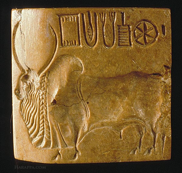
Throughout the ages, mankind has attempted to communicate by the use of visual language. The seals of the Harrappa and Mohenjodaro civilizations chronicled the lives of the people of their times. The ancient Egyptians invented hieroglyphic inscriptions to leave a timeless stamp of their rule on mankind. Chinese and Japanese pictorial texts attempted to communicate wordlessly across largely peasant populations. Royal writ and authority were sought to be asserted by the use of heraldry and crests on flags and coins in medieval times. There has always been a continuous search for a ‘wordless language.’

The arrival of the Internet Age and Globalised Branded Products made the need for such a universal visual vocabulary of symbols even more imperative. Today, we are surrounded in our everyday life by thousands of pictorial signs and symbols used as substitutes for words: on traffic signs; on maps; on utensils and appliances; on computers, and most of all on modern packaging. It is popularly said, a pictogram is worth a thousand words. Non-verbal communication offers several benefits over the written word. It guarantees a universal understanding of the message even across language barriers; its meaning can be grasped in a brief glance and it requires less space to print. In other words these needs reflect the times in which we live: a globalised world without too many cultural boundaries; a need for instant demand gratification (and a continuously texting, social networking generation) and the convergence of technology and portability. Truly, our world is moving rapidly and surely away from words and nothing reflects that trend more than pictographics and symbols as seen on our present day packaging.
We do not need to look too far back in time to observe how drastically our product packs have changed the visual landscape we live in. Packaging of the decades of the late sixties, seventies and even eighties reveals how verbal and ‘visually devoid’ the packs of those years were. While some of the limitations may have been due to the lack of prepress and advanced print technology a lot more was due to the fact that there was ‘simply no need.’ Our products were produced and sold in isolated, ‘protected’ markets, with no real fear of international competition and a ‘system induced’ environment of shortages and scarcity ensured that everything produced was sold with the least bit of marketing effort.
Packaging today enjoys none of those privileges. To do the job well packaging must not only protect the product (and convey increasingly demanding statutory information) but also communicate effectively at the so called First Moment of Truth (FMOT). The FMOT moment is the time a customer takes to look at a package in a shop, pick it up and then decide whether to drop it into her shopping basket or put it back on the shelf. In our present day busy lives, the FMOT is getting increasingly brief and calls for nothing more than a universally understood pictogram to convey the benefits of the product during just a brief glance. This is the ‘visual shorthand’ phraseology modern packaging demands.
The essential purpose of all visual phraseology seen on packaging today remains the same: that is, to compress (‘zip’) a lot of information into a small easily comprehended visual device. Broad categories for such visual devices as observed are:
Functional Pictograms
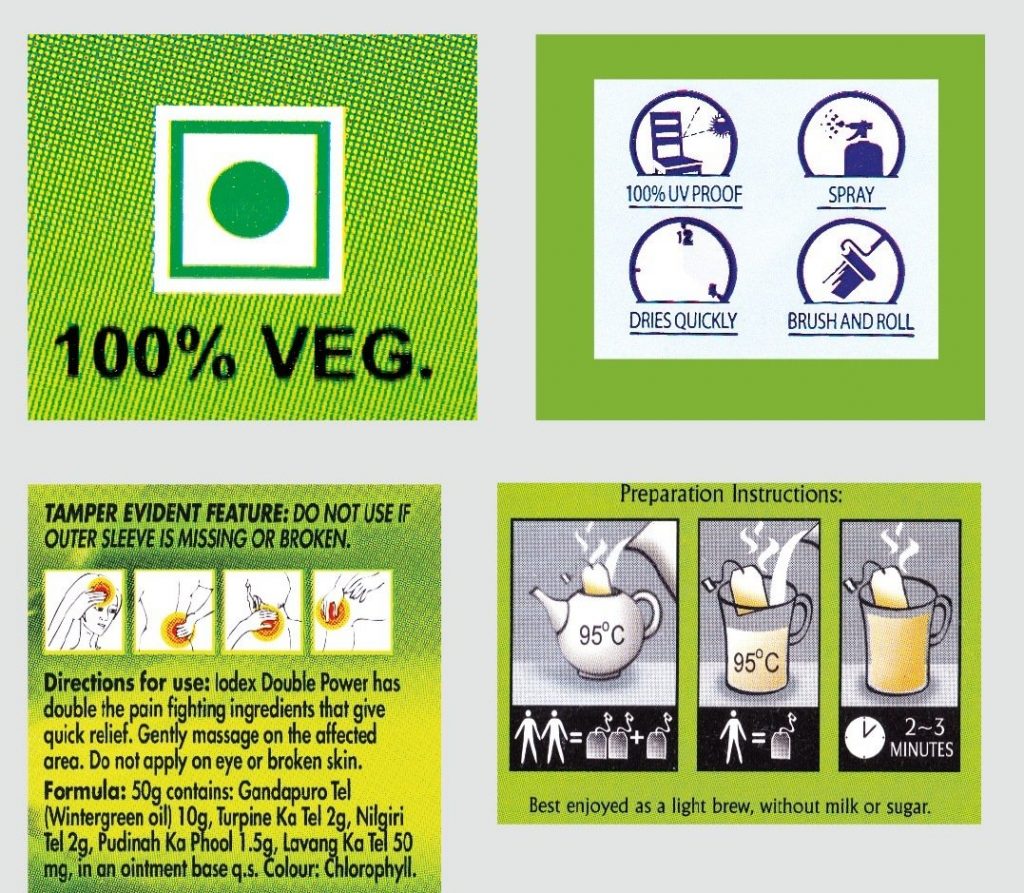
These are need based and often presented as pictograms of essential instructions such as: Keep Away from Light, Do not Litter, This Side Up, Hazardous and Vegetarian. The familiar Bar Code (and its present day variants) can also be said to be extensions of the idea of a pictogram except that a ‘translator device’ (bar code reader) is required to read them. In fact, while pictograms can easily be read by humans across cultures, bar codes are meant to be read by machines across culture.
Benefit Iconography
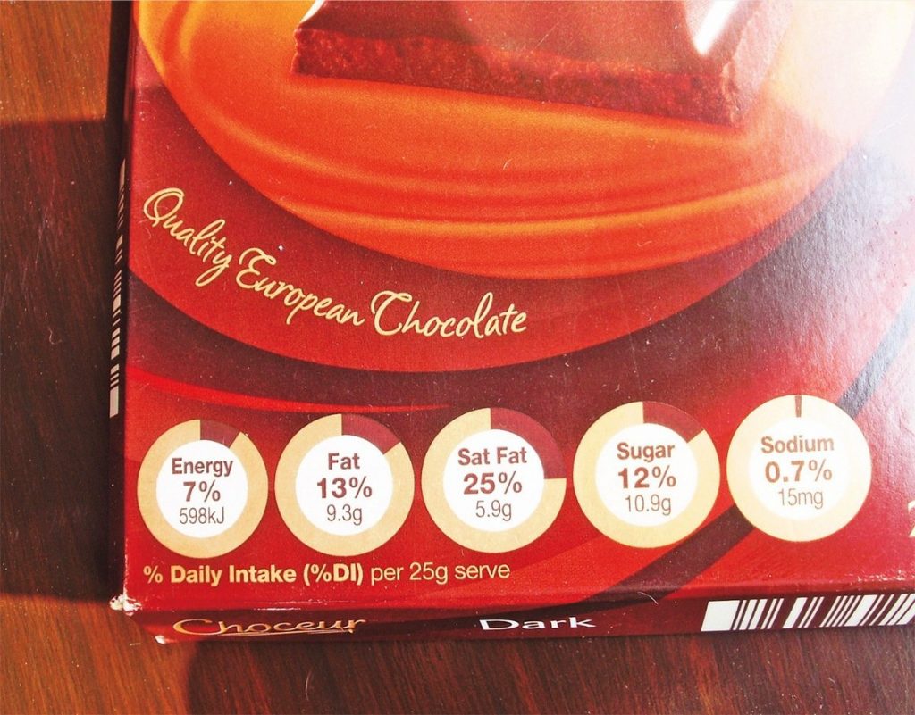
Availability of improved prepress and print technology has made it possible to creatively compress a complex message about the benefit of a product and deliver it in a short visual burst. Such ‘benefit iconography’ (usually highlighting the USP of a product) is often seen on personal care and food products, as for example: ‘24 hour Tooth Protection’ or ‘0% Cholestrol, Transfats.’
Premium Heraldry
Lifestyle products that reflect the status of customers using them often need to provide differentiating cues on the package design that will suggest their superior quality. Liquor, cigarettes and premium cosmetics and food often use royal heraldry crests and symbols to create such visual atmosphere on their packaging.
Clearly the visual trend is here to stay. The written word on packaging has to give way, more and more to the exciting visual vocabulary of art. Pack designers have realized the power of the visual device to convey information quickly, across cultures in a way that enhances the appeal of the product. Art and technology have converged on packaging in beautiful ways that will no doubt keep future archaeologists digging for more in the not-so- beautiful, non-biodegradeable rubbish dumps we have also, sadly, created for future generations!
This above article was originally published in the June 2011 print issue of Packaging South Asia.